
Table of Contents
A retention graph is a simple chart that shows how long people stay watched your video. It can’t tell you exactly why it changed.
That distinction is the starting point for useful YouTube analytics.
For creators who regularly analyze videos and plan new content, a workflow tool such as ytZolo can also help organize the research, scripting, titles, and other parts of the YouTube production process. That keeps retention analysis connected to the actual content decisions you make for future videos.
Do not assume every drop in a graph means your content is bad, and do not assume every spike means it is great. Instead, how to read YouTube Analytics retention graphs is to look at the graph like a timeline of clues. Use it to investigate exactly what happens at the specific moment.
For example, a dip might just mean you posted at a weird time, and a spike might mean a famous person shared your link. Treat the chart as a starting point to ask questions and find the real story.
Find the pattern. Locate the timestamp. Watch what happened. Form a hypothesis. Check other analytics. Then make one change in a future video and see whether the pattern changes.
That is a much more reliable way to learn from audience retention.
Start With What the Graph Is Actually Measuring
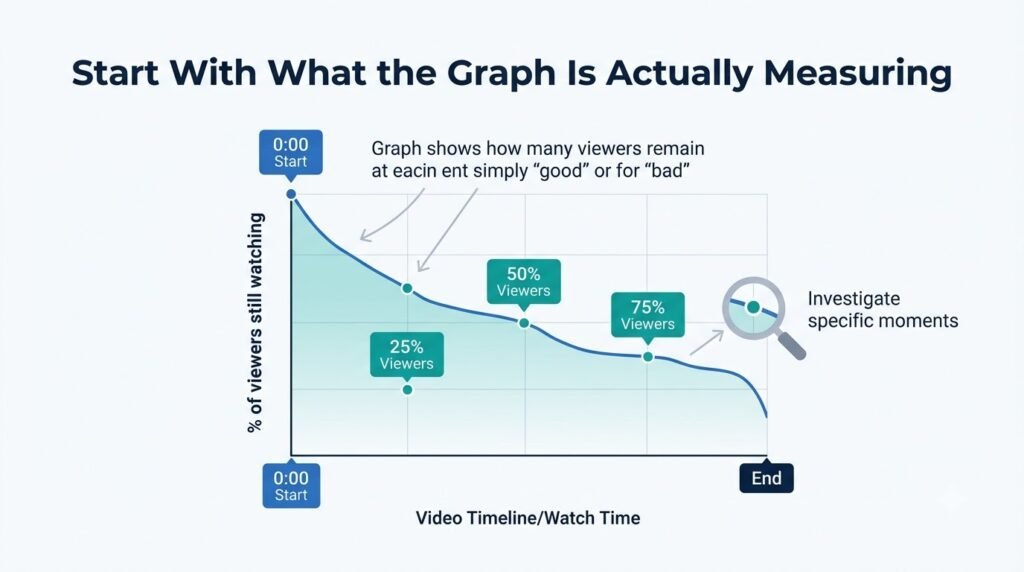
YouTube audience retention shows how well different moments of a video hold viewers’ attention. The main graph shows how people watch the video from start to finish.
The retention percentage tells you the proportion of viewers still watching at different points.
Think of it as a moving snapshot of the audience rather than a single score.
A fictional example makes this easier.
Imagine a 10 minutes tutorial starts at 100% retention. At 30 seconds, 68% of viewers remain. At two minutes, the line is around 58%. At 4:10, it suddenly falls to 43%. It then stays relatively stable until the end.
The most useful observation isn’t simply that the video ended at 30% retention.
The interesting question is:
What happened around 4:10?
That timestamp gives you a place to investigate.
What the timeline represents
The horizontal line (left to right) shows the video’s time from start to finish. That means a change at 0:20 pints to the opening. A change at 3:45 points to something that happened around 3 minutes and 45 seconds into the video.
This makes retention different from a summary matric such as average view duration. Average view duration gives you one number. The retention graph gives you a location of behavioral changes.
Why the line matters more than one number
A single percentage can hide useful information. Two videos might have similar average percentage viewed while having completely different curves.
One might lose many viewers during the opening and then remain stable.Another might hold viewers well for several minutes before a large mid-video drop.
Those are different editorial problems.
The curves helps you decide where to investigate before you decide what to change.
Where to Find Audience Retention in YouTube Studio
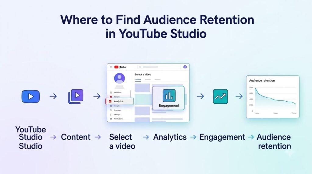
For a video, open Youtube Studio and go to content.
Select the video you want to analyze, choose Analytics, then open the Overview or Engagement area and loo for the audience retention report.
Youtube says retention data take typically 1-2 days to process.
Youtube updates it’s design often, so look at the actual labels on your screen instead of old screenshots.
You may also click on SEE MORE option that provides additional comparison data.
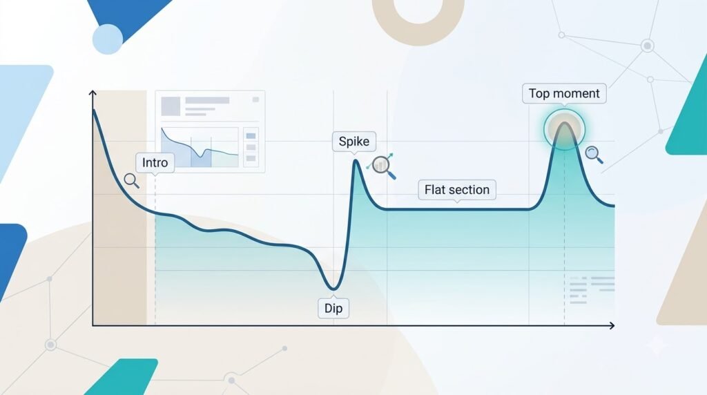
Not every video will have every highlighted key moment. YouTube notes that the highlighted Intro, Top moments, Spikes and Dips are only shown when detected, and the video needs to be at least 60 seconds long with at least 100 views for those highlights.
That matters because an absent label isn’t automatically a sign that something is wrong with the video.
Read the Graph in This Order
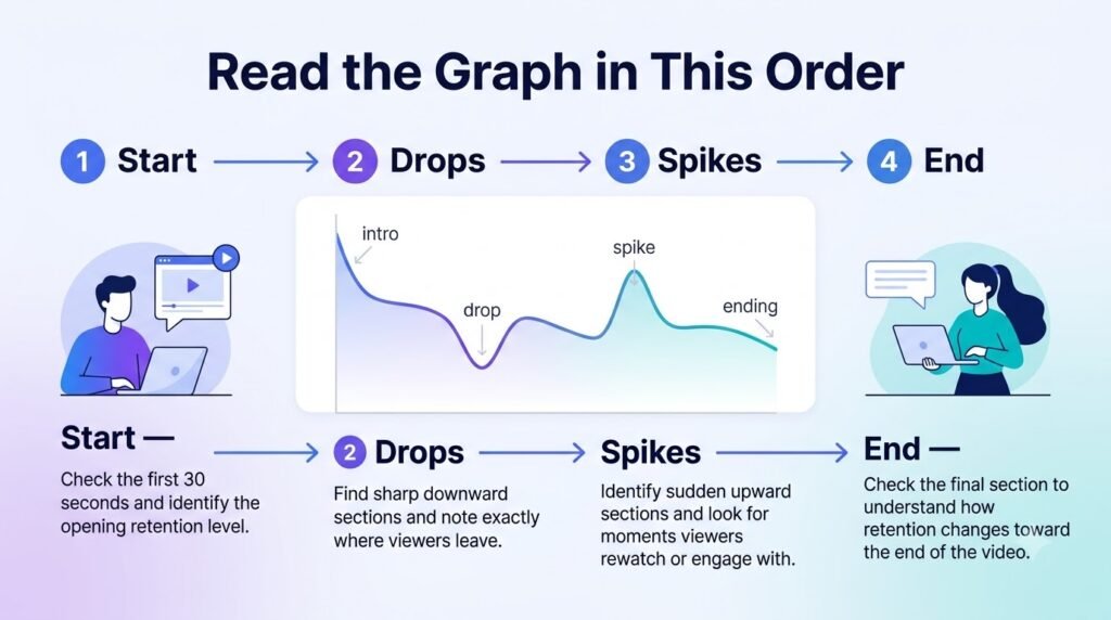
Don’t start by hunting for the biggest dip.
Read the graph from left to right.
1. Check the opening
Start with the first 30 seconds.
YouTube’s Intro metric tells you what percentage of your audience was still watching after those first 30 seconds.
YouTube specifically connects a strong intro with the relationship between the opening and the viewer’s expectations from the title and thumbnail.
So don’t analyze the opening in isolation.
Ask:
- What did the title promise?
- What did the thumbnail suggest?
- What did the viewer actually see first?
- How quickly did the video deliver useful information?
- Was there a long greeting, logo animation or setup?
- Did the opening match the reason someone clicked?
If many viewers disappear immediately, you have a clue.
You don’t yet have a confirmed cause.
2. Read the overall curve
Next, ignore individual fluctuations and focus on the overall trend.
A gradual decrease is completely normal. YouTube itself notes that videos generally taper off as playback continues. A relatively steady decline therefore isn’t automatically a problem.
What is of concern, however, is an unexpected fluctuation.
For example:
100% → 72% → 64% → 58% → 52%
is a different pattern from:
100% → 65% → 62% → 39% → 37%
The second example contains a much more obvious point for investigation.
If a retention drop follows a removed or restricted video, review what happened before changing your strategy. This YouTube copyright strike appeal guide explains the steps creators can take.
3. Find unusual changes
Once you’ve understood the overall curve, look for places where viewer behavior changes more sharply than the surrounding pattern.
These can include:
- sudden dips
- spikes
- unusually flat sections
- changes after a transition
- sections that outperform the surrounding video
Write down the timestamps.
Don’t try to explain everything at once.
4. Compare with typical retention
YouTube provides typical retention so creators can compare a video with their recent videos of similar length.This is more useful than searching for one universal “good retention” percentage.
A 5 minutes tutorial, 25 minutes documentary and 45 minutes interview serve different viewing situations.
Your own comparable videos give you a more relevant baseline.
What Each Retention Pattern Can Tell You
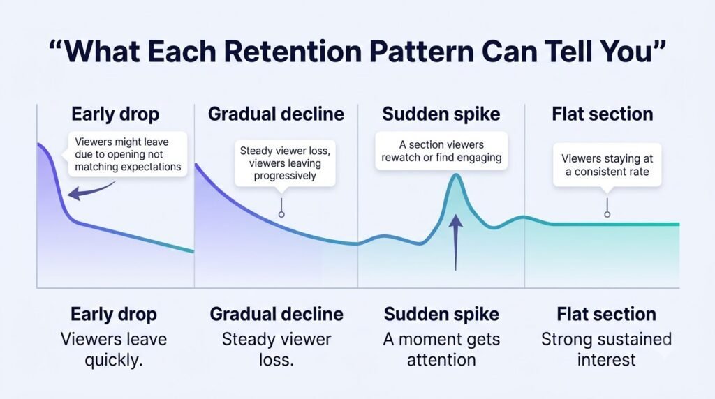
A graph shape is evidence, not a diagnosis. The same pattern can have several possible explanations.
The first 30-second drop
Some early decline is expected.
The useful question is whether your opening loses viewers faster than your comparable videos and what was happening during that period.
If your video drops from 100% viewership down to 61% in the first 30 seconds, it does not mean your hook failed.
Watch the opening.
Maybe the video starts with 12 seconds of branding before explaining the topic.
Maybe the title promises a tutorial but the video starts with background information.
Maybe the opening is actually strong, but the video attracted viewers with an expectation that the content doesn’t satisfy.
Your analysis should connect the graph to the actual viewing experience.
Gradual declines
A gradual decline means viewers are leaving progressively rather than disappearing at one specific moment.
This could happen for many reasons.
The video may be naturally reaching viewers who only needed part of the information.
The pacing may also become less effective.
A long explanation might contain useful information but still be difficult to follow. The tutorial can also answer the question early in the video, causing the viewer to stop watching.
Don’t panic over a slow, gradual decline.
Viewers naturally leave as a video goes on, so you don’t need to try and fix every single minor drop.
Instead, ask whether the decline is consistent with the video’s purpose and whether comparable videos show a different pattern.
Sharp dips
A dip is one of the most useful places to investigate because it gives you a specific section to inspect.
A “dip” on your YouTube chart shows the exact moment viewers skipped ahead or turned off your video.
Now watch the video around that timestamp. Don’t watch only the exact second. Watch the preceding 15–30 seconds and the following section.
Look for changes such as:
- a long explanation
- a sudden topic change
- repetitive information
- a confusing transition
- a sponsor segment
- a visual that becomes static
- an audio problem
- a payoff arriving earlier than expected
- a section that answers a question before the viewer has a reason to continue
Then write down a hypothesis.
For example:
“The drop around 4:10 may be connected to a long explanation with no visual support.”
That’s a hypothesis.
It is more useful than writing:
“People hated this section.”
You don’t have enough evidence to know that.
Spikes
Spikes deserve careful attention because they aren’t automatically positive.
YouTube says spikes can occur when more viewers are watching, rewatching or sharing a part of the video.
It also notes that a spike can occur because viewers had to rewatch a section because the content wasn’t clear.
So a spike means:
Investigate this moment.
It does not automatically mean:
Make more of this exact thing.
If a tutorial has a spike when a complicated formula appears on screen.
There are at least two possibilities.
Viewers may have found the explanation especially useful and replayed it.
Or they may have needed to replay it because the explanation moved too quickly.
Watch the section.
Look at what changed.
Then decide what the spike actually suggests.
Flat sections
A flat section means viewer levels remained relatively stable during that part of the video.
YouTube describes a flat line as viewers watching that portion from start to finish.
That can be a useful signal.
If your graph has a long stable section around a particularly useful explanation, inspect what makes that section different.
Maybe the structure is clearer.
Maybe the pacing improves.
Maybe the visuals directly support the narration.
Maybe the audience has reached the exact information they came for.
A flat section doesn’t prove that one editing technique caused the stability. It gives you another place to investigate.
Top moments
YouTube describes Top moments as points where almost no one dropped off while watching.
If an important top moment appears late in the video, consider whether a similar idea could have appeared earlier.
Since audience size naturally drops as a video goes on, YouTube recommends moving your best, most exciting content to the very beginning so more people actually see it.
This doesn’t mean moving every interesting section to the beginning.
It means asking whether the strongest material is arriving after too many viewers have already left.
Don’t Confuse Retention Percentage With Viewer Activity
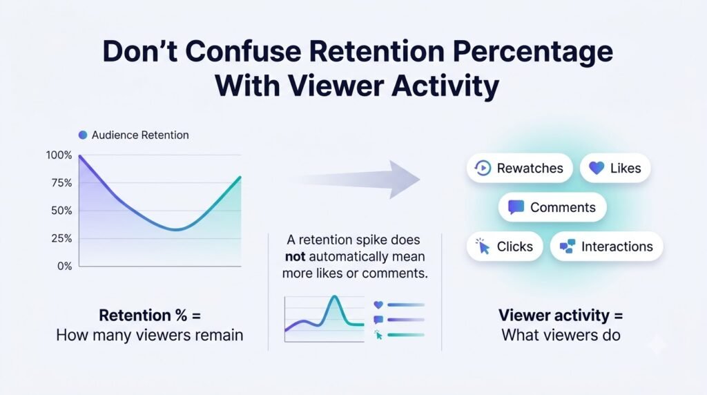
One of the easiest mistakes is assuming that the percentage graph tell you everything. It does not.
Youtube also provides detailed activity showing absolute number of views for different parts of video.
These two Perspectives answer the different questions
Percentage-based retention
Percentage retention helps answer:
What proportion of the audience is still watching here?
This is useful for understanding the shape of viewer retention across the video.
Absolute viewer activity
Absolute activity helps answer:
How much viewing activity is happening at this part of the video?
That distinction becomes important when you analyze different videos or investigate repeated viewing.
YouTube notes that the absolute number of views for a segment can sometimes exceed the video’s overall view count because the same viewer may watch portions of the content multiple times.
So don’t assume that every number represents a unique person.
A rewatch can create additional activity.
Why both views matter
Imagine two fictional videos.
Video A starts with 10,000 viewers and reaches a section with 20% of the audience remaining.
Video B starts with 500 viewers and reaches the same section with 40% remaining.
The percentages tell different stories about relative retention. The absolute audience sizes tell another story.
Focus on the big picture, not just a single high percentage. Retention analysis is about understanding the story of your video, not just chasing a perfect number.
Use Other Analytics to Investigate the Graph
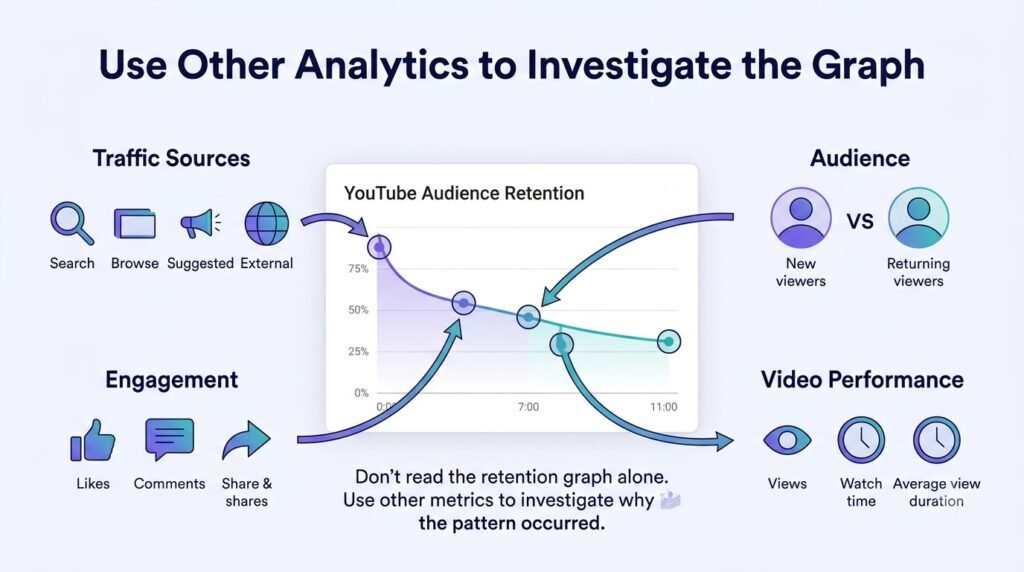
Retention is more useful when you combine it with related metrics.
Retention vs. average view duration
Average view duration tells you the average amount of time viewers watched.
Retention shows where the viewing behavior changed.
Use them together.
If your average view duration is increasing in the graph while the shape is becoming more stable in the middle, it may be worth repeating your change.
If your graph is low but has a section in it that’s high, it might be worth closer inspection on that section.
Retention vs. average percentage viewed
Average percentage viewed expresses the average percentage of the video watched.
This is useful in comparing two videos of different lengths, but it still cannot substitute the graph. Two videos can have a similar average percentage, but they can lose viewers at a different point.
Use average percentage viewed as a summary.
Use the retention graph as the diagnostic view.
Retention vs. watch time
Watch time measures the amount of time viewers watched your video.
A longer video and a shorter video can therefore produce different absolute viewing time even if their percentage retention differs.
YouTube’s performance guidance says its discovery system uses both absolute and relative watch time and broadly notes that relative watch time is more important for shorter videos while absolute watch time is more important for longer videos.
That is another reason not to build your entire analysis around one retention percentage.
Retention vs. CTR
CTR answers a different question. It helps you understand how often viewers watched after seeing a thumbnail impression.
Retention starts after people are watching.
This creates a useful diagnostic sequence:
Impression → click → viewing → retention
If CTR is weak, investigate packaging.
If CTR is reasonable but viewers leave immediately, investigate the opening and expectation match. If the opening is stable but viewers leave during a particular section, investigate that section.
Don’t use retention to diagnose a problem that happens before the viewer starts watching.
New vs. returning viewers
YouTube provides audience-retention segment comparisons for new and returning viewers.
This can reveal differences that a combined graph hides.
Imagine returning viewers remain relatively stable while new viewers drop sharply during the opening.
That doesn’t prove your opening is the sole problem.
But it gives you a useful question:
Does the opening make sense to someone who doesn’t already know this channel?
Returning viewers may already understand your format, terminology or recurring series.
New viewers don’t have that context.
Subscribers vs. non-subscribers
YouTube also supports subscriber and non-subscriber retention segments. This can help when a video performs differently for people who already have a relationship with the channel.
For example, if your subscribers stay for a regular segment but new viewers leave, check if that part requires inside knowledge that outsiders don’t understand.
Again, the graph gives you evidence for a question.
It doesn’t provide the answer by itself.
Retention patterns can also differ during live content. If you’re planning your first stream, this YouTube live streaming setup guide for beginners covers the essential setup before you go live.
How to Diagnose a Drop Without Guessing

Use a five-step process.
Step 1: Locate
Find the exact timestamp where the unusual change occurs.
Step 2: Watch
Watch the surrounding section in the actual video.
Do not rely on memory.
Step 3: Hypothesize
Write down one plausible explanation.
For example:
“The transition may be too abrupt.”
Not:
“Everyone left because the transition was bad.”
Step 4: Check
Look at supporting context.
Compare the segment with typical retention.
Check viewer segments if available.
Review similar videos on your channel.
Look for the same pattern elsewhere.
Step 5: Test
Make one deliberate change in a future video.
If the problem was a slow transition, shorten or restructure the transition.
If the problem was unclear context, make the explanation more explicit.
If it looks like a case of misplaced expectations, look at the relationship between the title, thumbnail and opening again.
By changing one variable, you can get an easier time figuring out the next result.
Once you know what you want to test, keep the change focused. Tools such as ytZolo can help with the surrounding content workflow, from developing new video ideas and scripts to refining titles and descriptions.
The retention graph remains the evidence you use to judge whether a change in the actual video made a difference.
A Repeatable YouTube Retention Audit
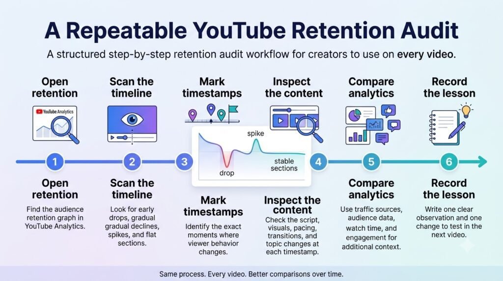
You don’t need a complicated analytics system.
A simple log can turn retention analysis into a repeatable editorial process.
| Timestamp | Graph pattern | What happened in video | Possible reason | Evidence to check | Next test |
| 0:00–0:30 | Early drop | Long setup | Slow value delivery | Compare intros | Shorter opening |
| 3:40 | Sharp dip | Topic transition | Context may be unclear | Watch preceding section | Add transition |
| 5:15 | Spike | Demonstration | Useful or unclear section | Rewatch behavior | Test earlier placement |
| 7:30 | Flat section | Step-by-step example | Strong clarity | Compare similar videos | Repeat structure |
The numbers in this table are fictional examples, not benchmarks.
Audit one video first
Start with:
- The Intro.
- The largest unexpected dip.
- The strongest spike or top moment.
- The longest stable section.
- The ending.
You don’t need to explain every movement on the graph.
Focus on the changes that are large enough to deserve investigation.
Then audit several comparable videos
One video can be unusual.
Five or ten comparable videos can reveal a pattern.
Look for repeated events.
Does the opening consistently lose viewers?
Do tutorials hold better when a strike appears early?
Do sponsor sections repeatedly produce dips?
Does a particular format consistently create a stronger middle section?
The more often a pattern appears under similar conditions, the more useful it becomes as a production hypothesis.
Keep the change small
Don’t respond to one dip by changing your title, thumbnail, script, video length, editing style and topic simultaneously.
You’ll have no idea what actually mattered. Choose one change.
Test it.
Then continue the cycle.
Find → inspect → hypothesize → test.
That’s the useful part of retention analytics.
If you’re building a repeatable process for how to read YouTube Analytics retention graphs, keep your notes alongside the content changes you make. Record the timestamp, your hypothesis, the change you tested, and what happened in the next comparable video.
Over time, this creates a much more useful reference than looking at individual retention percentages in isolation.
What Retention Graphs Cannot Tell You
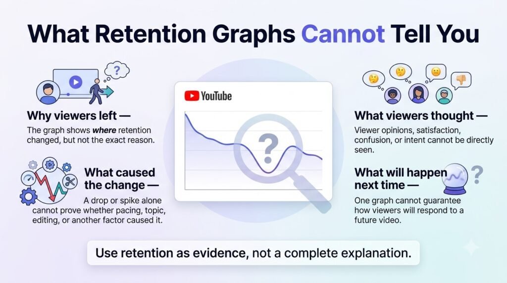
Retention data is behavioral evidence.
It isn’t a transcript of what viewers were thinking.
A graph usually cannot tell you with certainty:
- why an individual viewer left
- exactly what a viewer thought about a sentence
- whether the topic itself caused a drop
- whether a particular word caused an exit
- whether a viewer was distracted by something outside the video
- whether a future video will produce the same pattern
- whether a spike was caused by enjoyment or confusion
A dip can suggest a problem. It doesn’t prove the cause.
A “spike” on your graph means viewers rewatched a part or skipped forward to see that exact moment.
It doesn’t prove that the section should simply be repeated.
The goal is not to remove uncertainty.
The goal is to reduce it enough to make a sensible next test.
Common Mistakes When Reading Retention Graphs
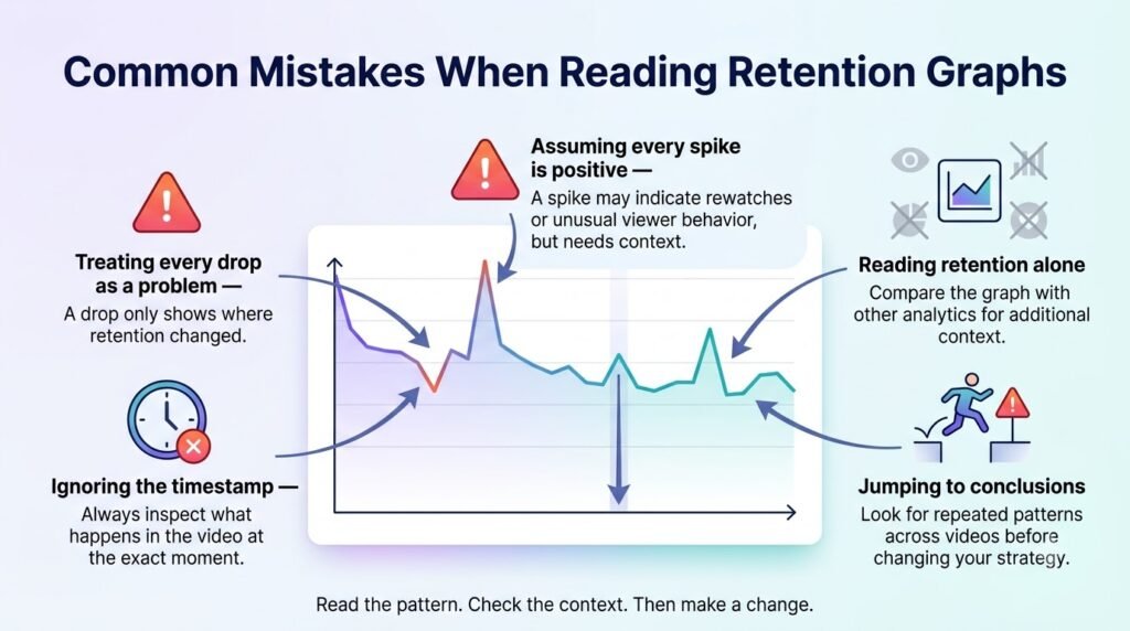
Comparing unrelated videos
Don’t compare a short explainer with a long-form documentary as though they have identical viewing behavior.
Use similar length, format and audience context where possible.
Chasing a universal retention percentage
There isn’t one percentage that makes every video successful. Video length, topic, audience, format and traffic context all matter.
Your typical retention comparison is often more useful than a random industry number.
Treating every dip as a failure
Some viewers will leave throughout almost any video.
Analysis unusually large or strategically important changes instead of reacting to every small movement.
Treating every spike as a success
A spike may represent rewatching, sharing or increased viewing. It can also indicate that viewers needed to replay something because it wasn’t clear.
Watch the section before deciding what it means.
Changing everything at once
If five things change between uploads, your next retention graph can’t tell you which change mattered.
Change one meaningful variable where possible.
Ignoring the actual video
Analytics are useful because they point you toward something real.
Once you find a timestamp, watch the footage. The graph should send you back to the content.
FAQs: How to Read YouTube Analytics Retention Graphs
How do I read a YouTube Analytics retention graph?
A good start is to look at the first 30 seconds of the video, then the general trend, any weird drops or increases, periods of stagnation, or peaks.
Compare this to the average retention of a video of a similar length, then check the footage around those timestamps.
What does a dip mean on YouTube retention?
A dip indicates that viewers skipped or stopped watching at that part of the video. It does not prove why they left. Think about the content around those timestamps, and if there’s issues such as pacing, transitions, repetition, or expectation mismatch.
What does a spike mean on YouTube retention?
A spike can indicate increased viewing, rewatching or sharing. YouTube also notes that viewers may rewatch a section because the content was not clear. Treat a spike as a point for analysis rather than automatically labeling it successful.
What is a good audience retention rate on YouTube?
There is no universal percentage that should be treated as a success threshold for every video. Video length, format, topic, audience and channel context affect viewing behavior.
YouTube’s typical-retention comparison is useful because it lets you compare a video with your recent videos of similar length.
What does the first 30 seconds tell you?
The Intro metric tells you what percentage of the audience was still watching after the first 30 seconds.
You can use that information to investigate whether the opening matches the expectations created by the title and thumbnail and whether the content delivers value quickly enough.
What is typical retention in YouTube Analytics?
Typical retention provides a comparison with the retention maintained by your latest videos of similar length. It is useful as a channel-specific reference point rather than a universal industry benchmark.
Why does my YouTube retention graph drop at the beginning?
An early drop can happen for many reasons.
The opening may be slow, the video may not immediately match the title and thumbnail, the viewer may have expected something different, or some viewers may simply have decided the video wasn’t relevant to them.
Watch the opening before you decide which explanation applies.
How can I use retention data to improve my videos?
Find a meaningful graph pattern, find its timestamp, watch that part of the video, write down a hypothesis, check supporting analytics and make one change in a future video.
Repeat this across several comparable uploads.
What’s the difference between audience retention and average view duration?
Audience retention shows how viewing behavior changes throughout the video. Average view duration gives you the average amount of time viewers watched.
The first is useful for locating changes. The second is useful for summarizing viewing time. Use both rather than treating one as a replacement for the other.
Should I compare retention between different video lengths?
You can study differences, but comparisons are more useful when the videos are reasonably similar in length and format.
YouTube’s typical-retention feature specifically provides comparison with recent videos of similar length.
Conclusion
The most useful way to read a YouTube retention graph is to stop treating it like a grade.
It is an investigation tool.
Start with the opening. Read the overall curve. Mark the unusual changes. Watch those timestamps. Form a hypothesis instead of assuming a cause. Check other analytics for context, then test one change in a future video.
Over several uploads, the graph becomes more than a report.
It becomes a record of what your audience repeatedly does, where their behavior changes, and which parts of your production deserve another look.
That is where retention analytics becomes genuinely useful.
Retention isn’t the only way to build a lasting audience. Creators can also turn YouTube viewers into direct subscribers by learning how to build an email list from your YouTube channel over time.
Author Bio
Anshika Verma is a content researcher and writer at ytZolo, focused on practical, research-based content about YouTube growth, creator tools, and AI-powered workflows.

