
Introduction: The 3-Second Rule That’s Killing Your Channel
You spent hours filming. You edited until 2 a.m. You wrote a title you thought was gold.
Then… silence.
Barely any clicks. No views. Your video just sits there collecting digital dust.
Here’s the hard truth most creators don’t want to hear: it’s not your content that’s the problem. It’s your thumbnail.
Knowing how to create a guide to tools & techniques for designing effective thumbnails is the single most powerful skill you can develop as a YouTube creator. Your thumbnail is the first thing a potential viewer sees — and research shows you have just 1.8 seconds to make them click.
In this guide, you’ll learn exactly how to create scroll-stopping, click-driving thumbnails using the right tools, the right techniques, and the right AI-powered strategy. We’ll also show you why smart creators are turning to ytZolo to skip the guesswork and go straight to results.
Let’s turn those thumbnails — and that channel — around.
Table of Contents
1. Why Your Thumbnail Is More Important Than Your Video
This might sound harsh, but stay with me.
You can create the most valuable, entertaining video on YouTube, but if no one clicks on it, the content never gets a chance to shine. That’s why mastering a guide to tools & techniques for designing effective thumbnails is so important. The algorithm doesn’t reward great videos alone—it rewards videos that earn strong click-through rates.
YouTube’s own data confirms that 90% of top-performing videos use custom thumbnails. Not auto-generated screenshots. Not lazy placeholders. Professionally designed, psychologically optimized, custom thumbnails.
A great thumbnail does three things at once:
- Stops the scroll — It visually interrupts the viewer’s browsing pattern.
- Creates curiosity — It hints at a payoff without giving the whole story away.
- Builds trust — It signals that your content is worth their time.
When you master effective thumbnail techniques, you’re not just designing an image—you’re writing a micro-sales pitch in a single frame.
That’s why this skill is worth mastering — and why the right tools make all the difference.
2. The Psychology Behind High-CTR Thumbnails
Great thumbnails aren’t just pretty. They’re built on proven human psychology.
Understanding this psychology is the first step in your guide to tools & techniques for designing effective thumbnails. Let’s break down the science.
The Curiosity Loop
Our brains hate unfinished stories. When a thumbnail hints at something without revealing everything, viewers feel compelled to click to “close the loop.”
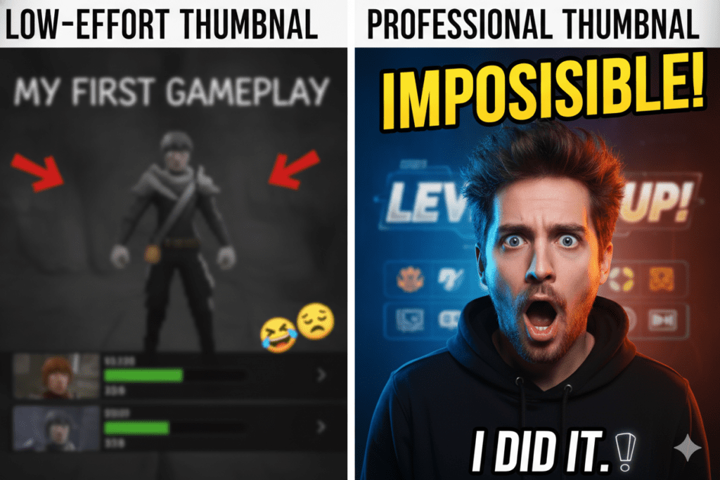
Think: a wide-eyed expression + bold text that says “You won’t believe what happened…”
That works every single time — because it’s wired into our neurology.
Fear of Missing Out (FOMO)
Humans are loss-averse. We’re more motivated by what we might miss than by what we might gain. Effective thumbnail techniques that imply urgency, exclusivity, or a surprising reveal trigger FOMO and drive clicks.
Words like “Before It’s Too Late,” “Secret,” and “Don’t Miss This” all tap into this psychological trigger.
Social Proof Through Emotion
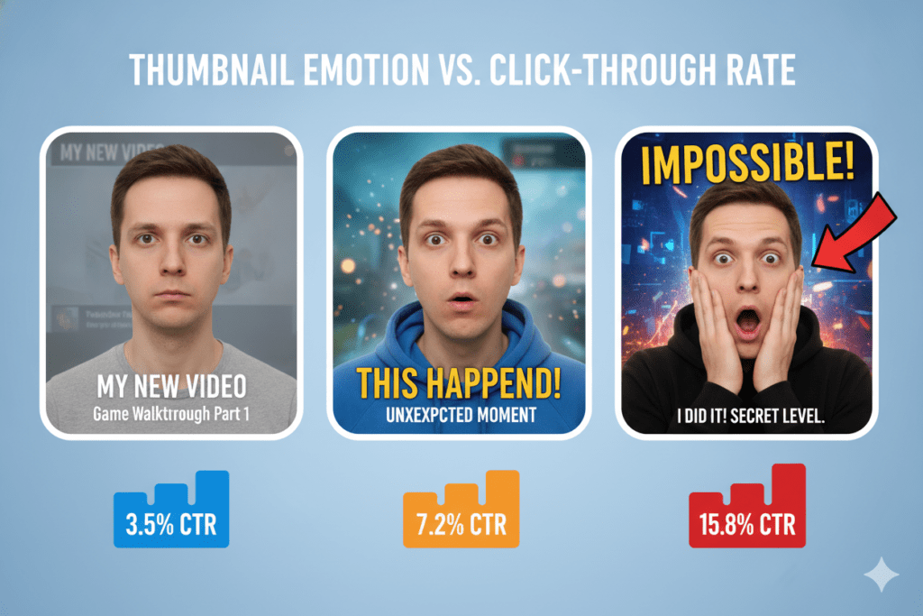
When we see a human face expressing a strong emotion — shock, joy, disbelief — our brains automatically mirror that emotion. It’s called emotional contagion.
A thumbnail with a wide-open mouth and raised eyebrows doesn’t just look dramatic. It feels dramatic to the viewer. And feelings drive clicks.
3. Technical Specs Every Creator Must Know
Before you pick up a design tool, you need to nail the basics. Get these wrong, and your thumbnail will look blurry, cropped wrong, or just unprofessional.
Here are the must-know specs:
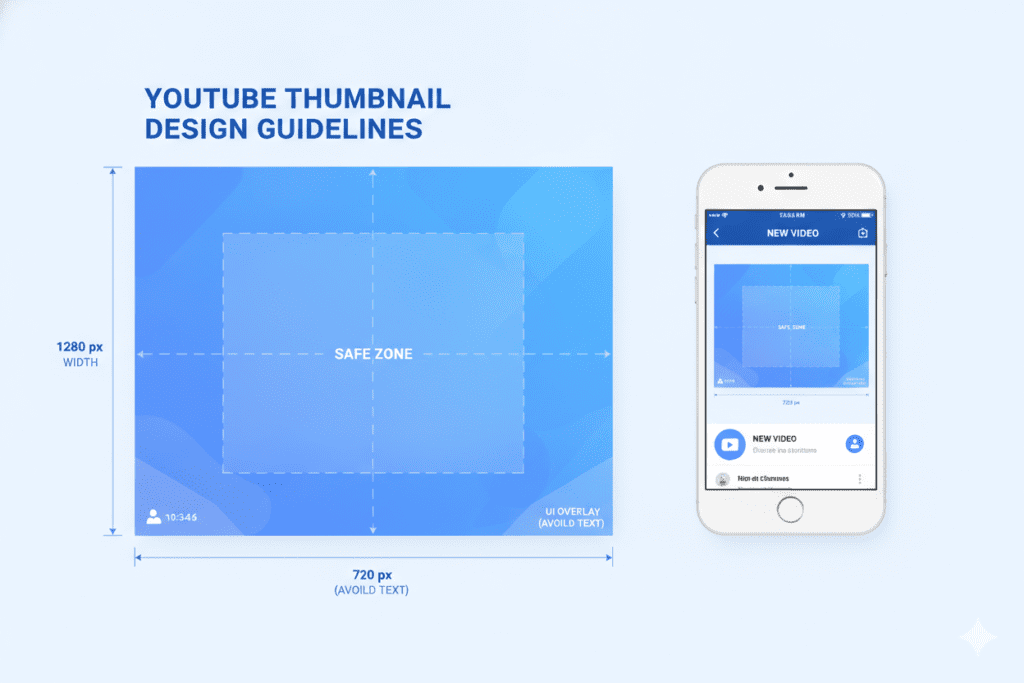
- Dimensions: 1280 x 720 pixels (minimum), 16:9 aspect ratio
- File Format: JPG, PNG, GIF, or BMP
- File Size: Under 2MB
- Resolution: 72 DPI minimum; 150–300 DPI recommended for crisp quality
- Safe Zone: Keep all critical elements (faces, text) within the center 80% of the frame. The outer edges may get clipped on mobile.
One thing many creators overlook: the mobile test. One of the most effective thumbnail techniques is optimizing for mobile, where over 70% of YouTube views happen. Before you publish any thumbnail, shrink it down to the size of a postage stamp and ask yourself — can I still read the text? Is the main subject clear?
If not, go back to the drawing board.
4. Core Design Techniques for Effective Thumbnails
Now we get into the good stuff. These are the proven design techniques that separate average thumbnails from viral ones.
This is where your guide to tools & techniques for designing effective thumbnails really starts to pay off.
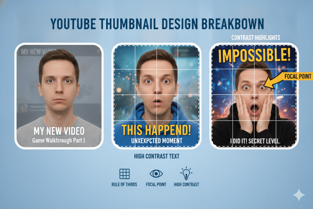
The Rule of Thirds
If you’re learning how to make YouTube thumbnails, divide your thumbnail into a 3×3 grid. Place your main subject (face, product, object) at one of the four intersection points—not dead center. This creates natural visual balance and makes the thumbnail feel dynamic rather than static.
Negative Space
Don’t cram everything in. White space (or any solid space around your subject) draws the eye exactly where you want it. It prevents visual chaos and makes your main element pop.
One Clear Focal Point
Every powerful thumbnail has ONE thing it wants you to look at. One face. One object. One number. One shocking image.
The moment you add two focal points, you split the viewer’s attention — and lose the click.
Contrast as a Visual Weapon
High contrast between your subject and background makes your thumbnail impossible to ignore. This applies to both color and light.
Dark background, bright subject. Bright text on a dark overlay. These effective thumbnail techniques work because they demand attention without asking nicely.
5. The Best Tools for Designing Thumbnails in 2026
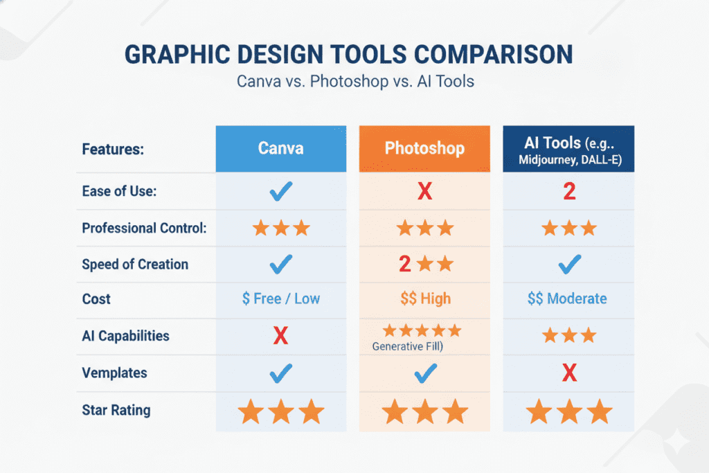
There’s no shortage of thumbnail creation tools out there. But if you’re learning how to make YouTube thumbnails, not all of them are created equal—especially when it comes to saving time, boosting CTR, and keeping up with what the algorithm rewards.
Here’s a breakdown of the top options creators use today.
Canva
The go-to for beginners. Canva offers hundreds of YouTube-specific thumbnail templates, a drag-and-drop interface, and a library of fonts and graphics. It’s free to start and easy to learn.
Best for: Beginners who want pretty templates fast. Limitation: Not built for YouTube algorithm optimization. Templates are generic. No AI-powered CTR insights.
Adobe Photoshop
The industry standard for professional designers. Photoshop gives you total creative control over every pixel.
Best for: Advanced creators with design experience. Limitation: Steep learning curve, costly subscription, and time-intensive for non-designers.
Figma
Excellent for creators who want advanced layout control and collaboration. Great for teams.
Best for: Designers and creative agencies. Limitation: Not beginner-friendly. No YouTube-specific optimization built in.
AI-Powered Thumbnail Tools (The Future)
In 2026, a new category of tools has emerged—AI thumbnail generators trained specifically on high-performing YouTube content, helping creators learn how to make YouTube thumbnails that attract more clicks.
These tools don’t just make things look good. They make things perform well.
And leading that category is ytZolo — the all-in-one AI YouTube growth platform built specifically for creators like you.
More on that in just a moment.
6. How to Use Color to Stop the Scroll: A Guide to Tools & Techniques for Designing Effective Thumbnails
Color is not just aesthetic. It’s strategic.
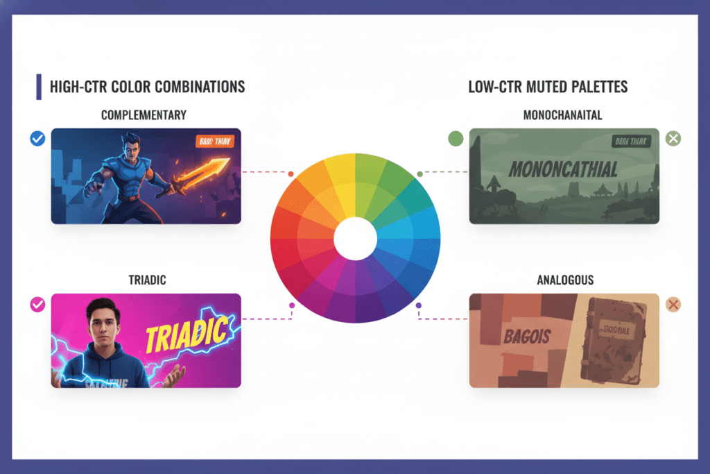
The right color choices in your thumbnails can dramatically increase or decrease your click-through rate. Research shows that high-contrast thumbnails with bold colors like yellows and oranges are among the most effective thumbnail techniques, increasing CTR by 20–30% compared to flat or muted designs.
Here’s a color cheat sheet for effective thumbnails:
Colors That Drive Clicks:
- Red: Creates urgency, alarm, and excitement. Studies show red thumbnails can achieve up to 23% higher click rates in certain niches.
- Yellow/Orange: Warm, attention-grabbing, and emotionally energizing. These pop against YouTube’s grey-and-white interface.
- Blue: Trust, authority, calm. Works brilliantly in educational and finance content.
- Green: Health, growth, prosperity. Strong in wellness, finance, and nature niches.
Color Combinations That Work:
- Yellow text on a deep navy background
- Orange subject on a dark grey or black background
- Red and white with high contrast (classic “news” energy)
- Blue and orange (complementary contrast that feels cinematic)
One Critical Rule: Avoid YouTube’s own red-and-white color scheme. Your thumbnail will visually blend into the platform’s interface and get lost.
Always run the grayscale test — turn your thumbnail black and white. If you can’t clearly see your subject and read your text without color, your contrast isn’t strong enough.
7. Typography Tricks That Make Viewers Click
Text on thumbnails is a superpower — when used correctly.
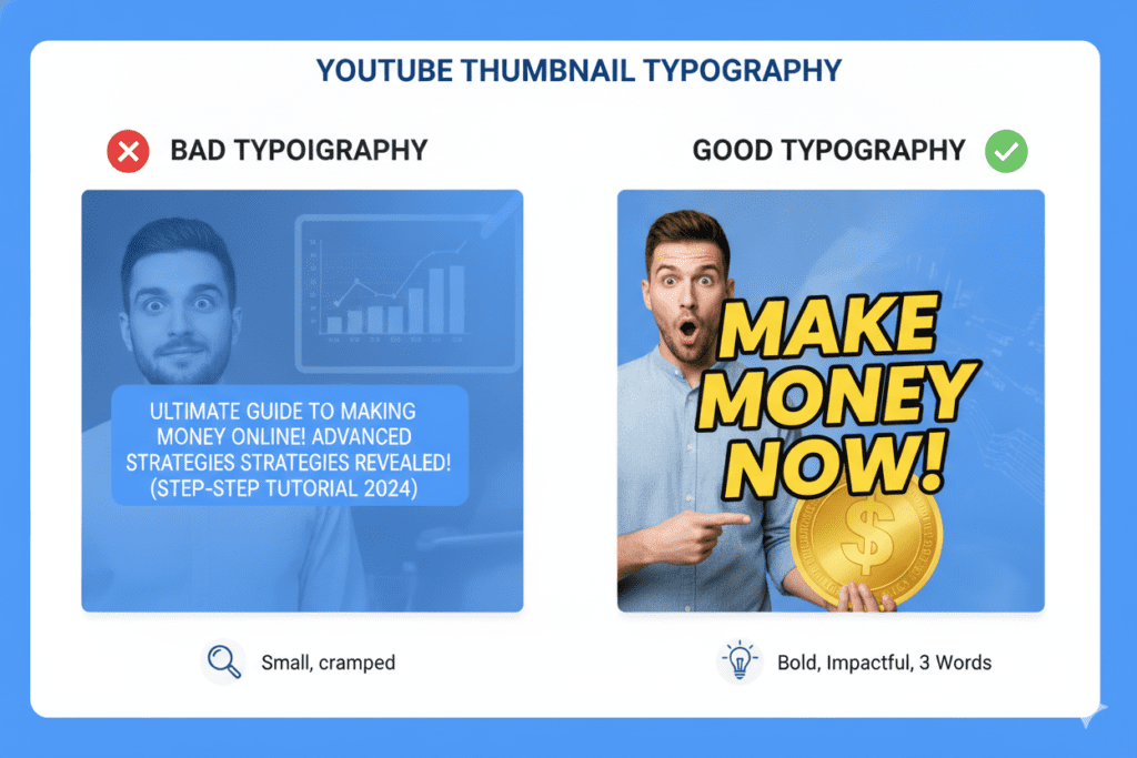
Most creators use too much text. Or the wrong font. Or a size that disappears on mobile. Without thumbnail A/B testing, any one of these mistakes can kill your CTR before you even upload.
Here’s how to use typography effectively in your thumbnails:
Keep It to 3–5 Words Maximum
Your text should amplify the visual, not explain it. If your image already shows the story, you don’t need a paragraph of text. Pick three to five powerful words that create curiosity or urgency.
Weak: “I tried the new 30-day fitness challenge and here’s what happened” Strong: “I TRIED IT. BIG MISTAKE.”
Font Rules to Live By
- Use bold, sans-serif fonts — they read fast and clearly at small sizes. Think Impact, Bebas Neue, or Montserrat Bold.
- Avoid script or decorative fonts — they look great on Pinterest, not on YouTube thumbnails.
- Use contrasting outlines or drop shadows so text is visible over any background color.
- Stick to one or two fonts maximum per thumbnail.
Capitalize for Impact
ALL-CAPS text on thumbnails reads as urgent and important. Use it for your key word or phrase. Don’t overdo it—but during thumbnail A/B testing, one all-caps phrase often packs a serious punch.
8. Facial Expressions and Emotional Triggers
Here’s a secret the biggest YouTubers already know: faces sell.
The human brain is wired to respond to other human faces—especially faces showing strong emotion. If you’re learning how to make YouTube thumbnails, remember that the most-clicked thumbnails on YouTube almost always feature a person with an exaggerated, unmistakable expression.
According to YouTube’s own creator insights, thumbnails with direct eye contact and dramatic expressions consistently trigger stronger emotional reactions — and more clicks.
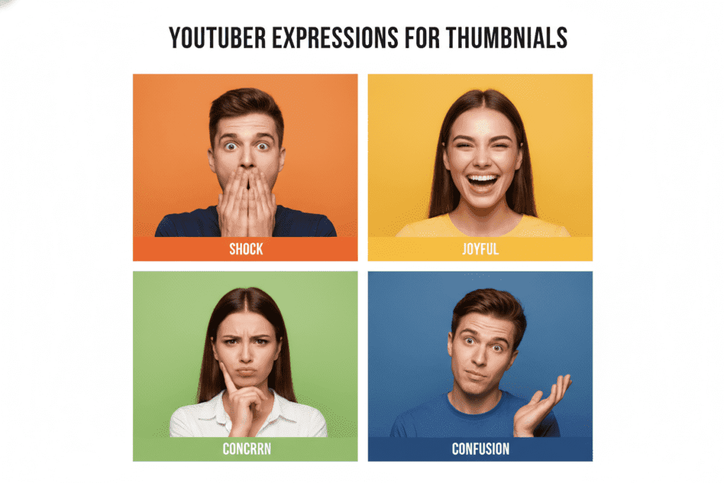
The expressions that work best:
- Shock/Disbelief: Wide open mouth, raised eyebrows, hands on face
- Joy/Excitement: Big grin, raised fists, celebratory body language
- Concern/Warning: Furrowed brow, pointed finger, dramatic lean forward
- Confusion: Head tilt, wide eyes, puzzled expression
One important note: the expression must match the video’s content. Using a shocked face for a calm tutorial feels dishonest—and thumbnail A/B testing often reveals that authenticity performs better. YouTube’s algorithm tracks whether viewers stay after clicking, so misleading thumbnails hurt your watch time and your channel long-term.
Authenticity wins every time. Be dramatic, but be real.
9. Why ytZolo Is Better Than Other Thumbnail Tools
Let’s talk about the elephant in the room.
You can learn all the design principles in the world—and still spend hours every week struggling with Canva templates, second-guessing your color choices, and wondering why your CTR isn’t improving with effective thumbnail techniques.
That’s the reality for creators who rely on manual methods.
ytZolo was built to solve exactly that problem.
What Makes ytZolo Different
Most tools on the market do one thing. TubeBuddy helps with A/B testing. Canva helps with design. VidIQ helps with keyword research. ChatGPT helps with scripting (kind of).
But ytZolo? It does everything — in one place, built specifically for YouTube.
Here’s what ytZolo brings to the thumbnail creation process:
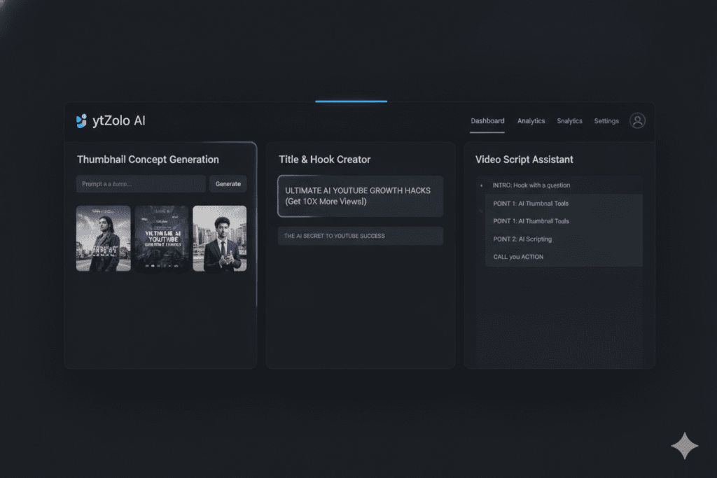
- AI Thumbnail Concept Generation: Paste in your video title and ytZolo generates scroll-stopping thumbnail concepts optimized for emotional impact and curiosity.
- CTR-Focused Design Intelligence: ytZolo’s AI is trained on thousands of high-performing YouTube thumbnails across dozens of niches. It doesn’t guess — it uses data.
- Complete YouTube Workflow: Beyond thumbnails, ytZolo also generates viral titles, SEO-optimized descriptions, high-performing tags, and full video scripts. It’s your entire content team in one AI tool.
- Built for Creators, Not Designers: You don’t need a design degree. You don’t need Photoshop skills. You need ytZolo.
Compare that to the competition:
| Feature | Canva | VidIQ | ChatGPT | ytZolo |
|---|---|---|---|---|
| Thumbnail AI | ❌ | Limited | ❌ | ✅ |
| Title Generation | ❌ | Partial | Partial | ✅ |
| Script Writing | ❌ | ❌ | Partial | ✅ |
| Tag Optimization | ❌ | ✅ | ❌ | ✅ |
| Description Writing | ❌ | ❌ | Partial | ✅ |
| YouTube-Specific AI | ❌ | Partial | ❌ | ✅ |
| Free to Start | ✅ | ✅ | ✅ | ✅ |
No credit card needed to get started. No steep learning curve. Just results.
“Your thumbnail is responsible for up to 70% of your click-through rate. A bad thumbnail means even a great title fails.” — ytZolo
When you combine everything in this guide to tools & techniques for designing effective thumbnails with ytZolo’s AI power, you stop playing the guessing game. You start making data-driven creative decisions that grow your channel faster.
Check out the ytZolo blog for more in-depth strategies on thumbnail optimization, title writing, and YouTube SEO.
10. How to A/B Test Your Thumbnails
Great thumbnail design isn’t just about creativity. It’s about data.
Even the best designers test their work. And you should too.
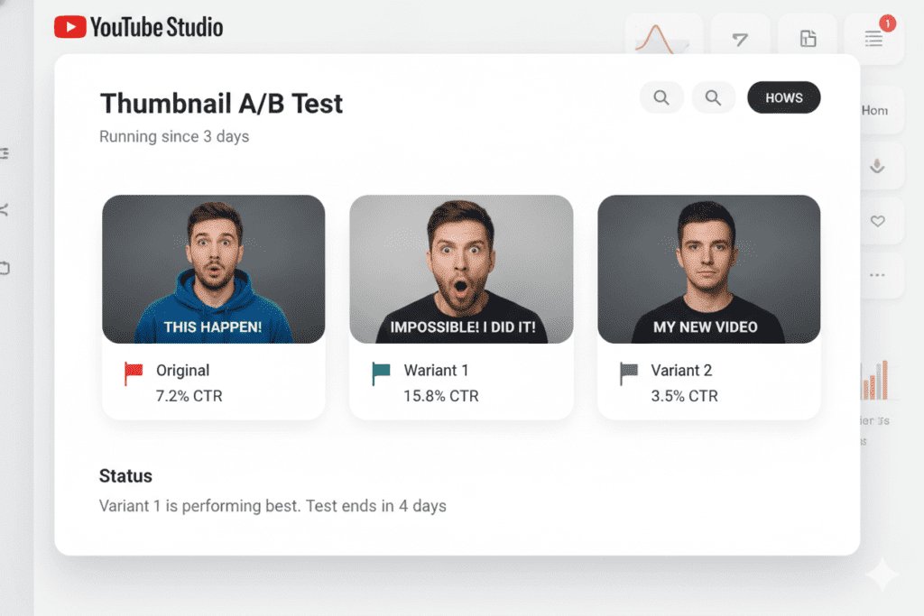
YouTube Studio now includes a built-in Test & Compare feature that makes thumbnail A/B testing easier by letting you upload up to three different thumbnail variations for a single video. YouTube then tests each version with your real audience and shows you which one performs best—measured by CTR, click volume, and watch time.
How to run an effective thumbnail A/B test:
- Upload your video with Thumbnail A.
- Go to YouTube Studio → Content → Your Video → Thumbnail.
- Select “Test & Compare” and upload Thumbnails B and C.
- Let YouTube run the test for at least 48–72 hours to gather meaningful data.
- Review the CTR for each version and lock in the winner.
Pro tip: Only change one element at a time per test. If you change the background color AND the text AND the facial expression all at once, you won’t know which change actually drove the improvement.
Test one variable per round:
- Background color vs. background color
- With text vs. without text
- Neutral expression vs. shocked expression
- Close-up face vs. wide shot
Over time, this data becomes your personal playbook — a guide to tools & techniques for designing effective thumbnails that’s built entirely on what your audience responds to.
Third-party tools like TubeBuddy Legend also offer split-testing capabilities if you want even more advanced testing options.
11. Common Thumbnail Mistakes That Are Killing Your CTR
You now know what to do. But let’s make sure you avoid what not to do.
These are the most common thumbnail mistakes creators make — and how to fix them fast.
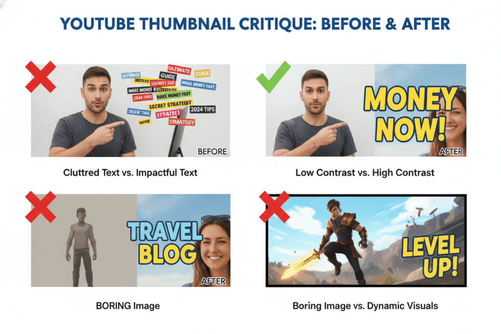
Mistake #1: Too Much Text If your thumbnail looks like a flyer for a garage sale, simplify immediately. One of the most effective thumbnail techniques is aiming for three to five words max. Every extra word is a viewer you lose.
Mistake #2: Low Contrast Dark text on a dark background. Light text on a light background. These combinations are invisible on mobile. Always prioritize contrast over aesthetics.
Mistake #3: Misleading Thumbnails (Clickbait) Using an image or expression that has nothing to do with your video is a short-term trick with long-term consequences. Viewers who click and leave immediately hurt your retention rate — which signals the algorithm to stop promoting your video.
Mistake #4: No Branding Consistency If every thumbnail looks different, viewers won’t recognize your videos in their feed. Use consistent fonts, a signature color palette, and a recurring visual style. Channels with consistent thumbnail styling see 15–20% higher CTRs from subscribers compared to channels with inconsistent approaches.
Mistake #5: Ignoring Mobile Thumbnail text that looks great on desktop becomes unreadable on a phone screen. If you’re learning how to make YouTube thumbnails, always preview your thumbnail at mobile size before publishing.
Mistake #6: Using Auto-Generated Screenshots This is the number one sign of an amateur channel. YouTube’s auto-generated screenshots almost always capture a blurry mid-sentence moment. Custom thumbnails are not optional — they’re essential.
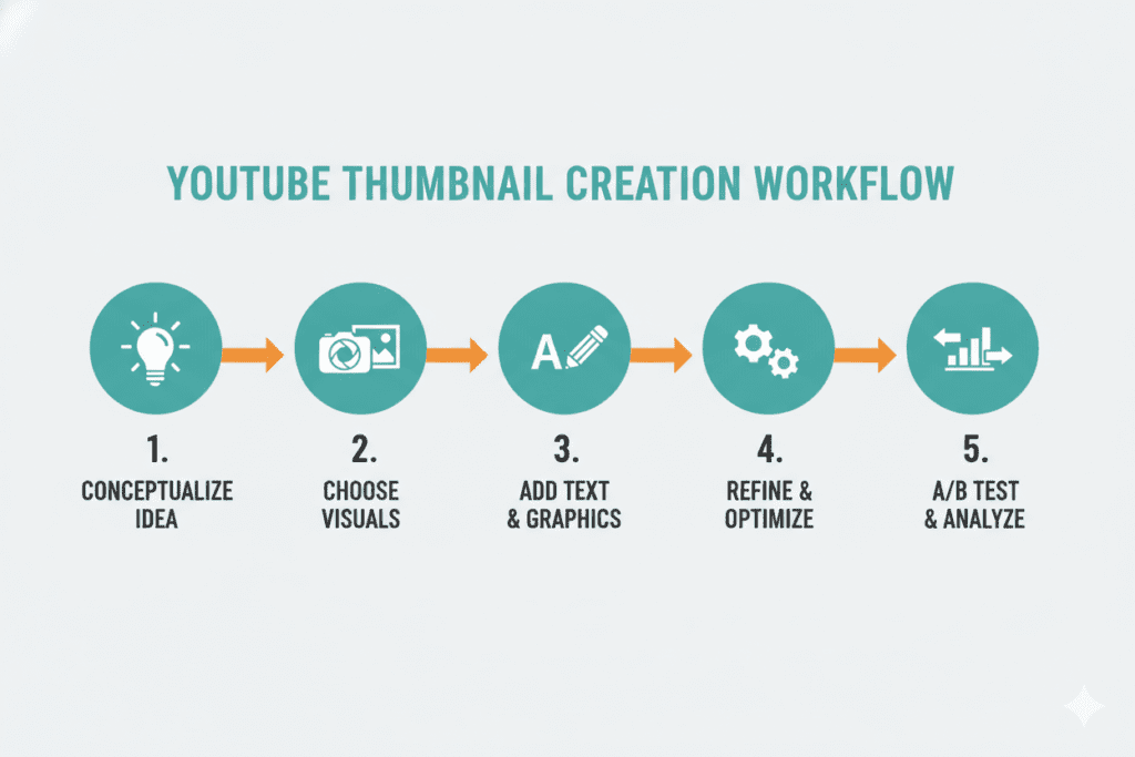
12. Step-by-Step: Create an Effective Thumbnail in 15 Minutes
Ready to put it all together? Here’s a fast, repeatable process for creating effective thumbnails every single time.
Step 1 — Define Your Emotion (2 Minutes) Before you open any tool—including an AI thumbnail generator—ask: what emotion do I want the viewer to feel when they see this thumbnail? Curiosity? Shock? FOMO? Excitement? Write it down. That emotion drives every design decision you make.
Step 2 — Capture or Source Your Hero Image (3 Minutes) Take a bold, well-lit photo of yourself (or use a relevant stock image). Make sure the expression matches the emotion you defined in Step 1. High-quality, expressive images are non-negotiable.
Step 3 — Choose Your Background (1 Minute) Pick a solid, high-contrast color or a clean blurred background. The background’s job is to make your subject pop — not compete with it.
Step 4 — Add Text (3 Minutes) Write three to five words using a bold sans-serif font. Position the text so it complements — not covers — your main subject. Use contrasting color and add a drop shadow or outline for readability.
Step 5 — Apply Color Psychology (2 Minutes) Check your color choices. Are they high contrast? Do they stand out from YouTube’s grey-white interface? Run the grayscale test. Adjust as needed.
Step 6 — Generate AI Thumbnail Concepts with ytZolo (2 Minutes) Head to ytZolo, paste in your video title, and let the AI generate thumbnail concepts optimized for CTR. Use these as inspiration or starting points. Often, the AI surfaces angles or compositions you wouldn’t have thought of alone.
Step 7 — Export and Test (2 Minutes) Export at 1280×720 pixels, under 2MB. Upload to YouTube. If possible, run a quick thumbnail A/B testing experiment with two variations and let the data decide the winner.
That’s it. Fifteen minutes. A thumbnail that actually drives clicks.
FAQ: Your Biggest Thumbnail Questions Answered
Q1: What is the best tool for designing effective YouTube thumbnails?
The best approach in 2026 combines a visual design tool (like Canva or Adobe Photoshop) with an AI-powered platform like ytZolo. Canva handles the visual side; ytZolo handles the strategy — generating thumbnail concepts, titles, and CTR-optimized ideas trained on real YouTube performance data. Using both gives you the fastest path to a high-performing thumbnail.
Q2: What size should my YouTube thumbnail be?
Your YouTube thumbnail should be 1280 x 720 pixels, in a 16:9 aspect ratio. The file should be under 2MB and saved as JPG or PNG. Always design in this size even if you plan to use it on other platforms. And remember: test every thumbnail at mobile size before publishing, since most viewers watch YouTube on their phones.
Q3: Does a better thumbnail actually increase views?
Yes — significantly. YouTube’s own data shows that 90% of best-performing videos use custom thumbnails. A well-optimized thumbnail directly improves your click-through rate (CTR), which is one of the strongest signals YouTube’s algorithm uses to decide how widely to promote your video. Higher CTR = more impressions = more views. Your thumbnail is the gatekeeper to all of that.
Q4: How many words should I use on a YouTube thumbnail?
Three to five words is the sweet spot for most thumbnails. The text should amplify curiosity or urgency — not summarize the video. Use a bold, readable font with strong contrast against the background. If your image already tells the story clearly, you can sometimes use zero words. The goal is instant comprehension in under two seconds.
Q5: How often should I update my thumbnail strategy?
You should revisit your thumbnail strategy every 30–60 days and after any significant shift in your CTR data. Use YouTube Studio’s Test & Compare feature to A/B test new designs regularly. Audience preferences and platform trends evolve — what worked six months ago may not perform as well today. Stay plugged into tools like ytZolo and check resources like the YouTube Creator Blog and HubSpot’s video marketing hub for the latest data on what’s driving clicks in your niche.
Conclusion: Your Thumbnail Game Starts Right Now
You now have everything you need.
You understand the psychology behind what makes viewers click. You know the technical specs, the color strategies, the typography rules, and the emotional triggers that drive results. You have a step-by-step process. And you know which tools actually move the needle.
The guide to tools & techniques for designing effective thumbnails you just read isn’t theory. It’s a playbook. A repeatable system you can use for every video you create from this day forward.
But knowledge without action is just entertainment.
So here’s your challenge: take one video — just one — and redesign the thumbnail using everything you’ve learned in this guide. Run an A/B test. Watch what happens to your CTR. Feel the difference that one image makes.
And when you’re ready to take it to the next level — when you want AI-powered thumbnail concepts, optimized titles, full video scripts, and SEO-tuned descriptions all in one place — you know where to go.
ytZolo is the all-in-one AI YouTube growth tool that thousands of creators are using right now to work smarter, publish faster, and grow their channels with confidence.
No more guessing. No more hours wasted on designs that don’t perform. No more watching other channels blow past you while you’re still stuck in Canva templates.
Explore more creator strategies, thumbnail tips, and YouTube SEO guides on the ytZolo blog — updated regularly with everything you need to stay ahead.
🚀 Start creating smarter, faster, and more viral YouTube content with ytZolo today. 👉 Visit ytzolo.com and start for free — no credit card required.

